Wednesday, February 16, 2011
those lines of trees
Tour poster and graphic t-shirt design for my good friends Treelines. They're going on tour for the month of March, go see them if they're in your hometown! The Lessons in Geography Tour.
Friday, February 11, 2011
Tasty Eats
Applied Illustration project. Cover and spot illustrations for a Vancouver tourism brochure. Go Food!
Labels:
fitness illustration yoga man,
food,
vancouver,
vector
Wednesday, February 9, 2011
Monday, February 7, 2011
CFS!
I'm on the cover of the Capilano courier this week!
Read the article online here at The Capilano Courier
Thursday, January 27, 2011
Make way for Ophiuchus
Quick illustration for the Capilano Courier. I was born and raised a Cancer, and apparently am a Gemini now, thanks to this guy. Just when I thought I knew myself inside out, astrology turns out to be a lie; time to explore numerology now to determine my future.
Wednesday, January 26, 2011
Jazz
Jazz poster illustration for my Applied Illustration class. Watercolour and digital touch-ups on 140lb arches papier.
Wednesday, January 12, 2011
new blag
After internet stalking the likes of Jessica Hische and Jon Contino, I've started experimenting on my own hand-letting and typography. I love the look and feel of organic type, so I'm going to strive to become good at it. I'll still upload design and other art stuff here, but check out this tumblr for all the little type things I'll be spinning out
The Type Experiments
Monday, January 10, 2011
International Typographic Poster
Poster designed in the style of the International Typographic Style, based on a combination of Josef Muller-Brockmann's designs.
David Suzuki Foundation
More past class assignments.
David Suzuki Foundation uncovered many toxic chemicals in your everyday cosmetic products, but narrowed it down to The Dirty Dozen we should avoid. We did a project for the Queen of Green, showcasing some ideas and directions for them to take. I decided to develop a Homemade Spa kit for girls to make their own products, aiming to keep it fun and light rather than doom and gloom.
More about The Dirty Dozen
David Suzuki Foundation uncovered many toxic chemicals in your everyday cosmetic products, but narrowed it down to The Dirty Dozen we should avoid. We did a project for the Queen of Green, showcasing some ideas and directions for them to take. I decided to develop a Homemade Spa kit for girls to make their own products, aiming to keep it fun and light rather than doom and gloom.
More about The Dirty Dozen
Sunday, January 9, 2011
Auto Show
My submission for the Vancouver International Auto Show. My only real experience driving (without my mom) was doing burnouts and donuts in parking lots in Kelowna. I very luckily, happily, and thankfully took Third place!! Big thank you to the New Cars Dealership Association, and I've been inspired to finally learn to drive. And an even bigger congrats to Leah Vlemmiks for First and Sarah Eno for Second!!!
Check out theirs and all the entries http://karinjager.wordpress.com/
Saturday, January 8, 2011
Empathy Series
The project was about creating awareness through a three piece series about your assigned illness/condition. The series is to include a poster, an information piece, and a portable display for trade shows. My objective was to create awareness that anxiety disorder is a very real illness, that not only can hinder your life, but can be treated.
The Poster. Big thanks to Katie and the class for exploring their club-party vibes.
The Flyer. This is to be stacked beside normal concert/dj event flyers in universities, coffee shops, etc. The average young adult would never get caught with a brochure about a medical condition, so this was aimed to catch them off guard, and show that they (or even their friends) don't need to deal with their fears or anxieties.
The Portable Display. Designed to draw people into the booth at tradeshows to learn what new techniques can be used to help with Anxiety Disorder.
Wednesday, October 27, 2010
HugABull Holiday Open House!
Created a poster for the upcoming Hug Event. I took some inspiration from an Ayden Gallery flyer for Chroma (show in August). Dave and I painted pup portraits for their calendar, which will both be showcased at the event. If you have a pup, bring it to the event!! Christmas portraits by donation...and you can never go wrong with pups in Christmas get up. Never!
Monday, October 25, 2010
Muted SUN TV
Falling a little behind on posting. Cap Courier illustration from last week for an article about Sun Tv (daughter company of Fox News) that was denied it's request to become a mandatory news channel.
Friday, October 8, 2010
Noises Off
Cap Courier illustration for the upcoming play, Noises Off! Hopefully I'll get time to go check it out.
Thursday, September 30, 2010
The question of equality
The latest illustration for the student newspaper. The article discusses the necessity of having a Women's Centre on campus in our modern day and age, pointing out some of the irony and old-fashioned points of view.
Labels:
equality,
feminism,
illustration,
rosie the riveter
Sinead O'Portman
A type portrait done for my typography class. I used a photo of Natalie Portman from V for Vendetta, but she looks more like Sinead O'Conner. Both pull off the shaved head look exceptionally well. Typeface was Brioso.
Thursday, September 23, 2010
Bring on the 90's
Here's my illustration for the Cap courier, our university newspaper. The article is about the general fitness activities you can do here on campus. The tone of the article is pretty mellow, by someone who isn't a big athlete or exercise enthusiast...well I got the impression he didn't really like exercise at all. Handrawn then scanned and coloured digitally, to try something new. Note to self, colouring on a laptop trackpad is not fun, nor easy.Vectoring my ink outline reminded me of the early 90's clip art of my childhood. Old school and retro is in, so I'm bringing back the 90's palette. Say yes to teal. Always.
Friday, September 17, 2010
scratch attack
We finally got our last assignments back from our illustration class last year. The class wrote a story one line at a time then drew to see who would illustrate which line. It was a cool assignment in that whoever wrote the line had to art direct the person who was to illustrate it. Not only did we have to produce another person's idea, but we had to do it the way they envisioned it...and preferably not in our personal "style". This is the first time I've used scratch board and really enjoyed it...as tedious as it can be haha.
...oh, and I can't remember what my line of the story was, but those are giant reception bars that had just exploded out of a broken cell phone. They're deadly ya know?
Labels:
calculator,
cell reception,
lance,
mace,
scratch board,
tomahawk
Monday, September 13, 2010
Oh Hunter
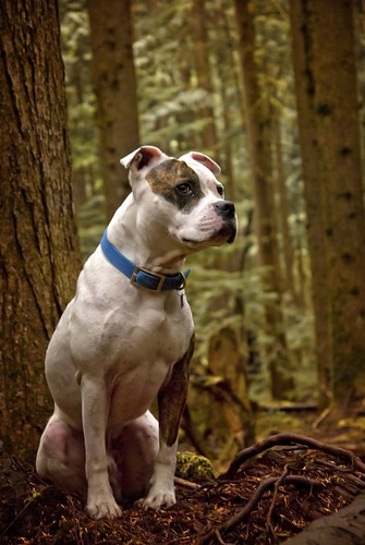
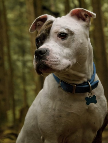
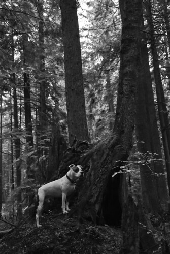
My second year here at IDEA has begun full force now. I've been spending a lot of time playing around in CS5 and experimenting with the different tools, techniques....really trying to get a sense of what I can accomplish with them. Anyways, here's some of the practice I was doing with photos of Hunter (my handsome little pittie). Enjoy!
Sunday, September 12, 2010
M.I.A.
I had made this at the beginning of the summer as a surprise for my friend (Angie) who is living over in China. I never posted before because I had wanted her to be the first to see it....buuuuut it appears to have disappeared into the abyss of China's postal system. So here it is for everyone to behold...and maybe it'll turn up somewhere, some day.
Subscribe to:
Posts (Atom)